Thursday 3 May 2012
Wednesday 18 April 2012
CD DIGIPAK FINAL OUTCOME

We did a quick alteration to the Cd Digipak at the last minute by incorporating a sketch of the lead singer into the inside left just to add a slight feel of the band members image seeing as we did not have a photo neither on the digipak nor the poster.
SKETCHES FOR DIGIPAK AND POSTER


This is the image of Jake (lead singer of CapeKaroo) which I used to do the sketch from.
 This is the sketch I did from the final design which we made using photoshop.
POSTER FINAL OUTCOME

After having designed the poster over and over again on screen until we received the most potent result. We then hand sketched it to make it more personal.
I intentionally did not go into much detail to make it more simple yet effective. I believe that the poster is now complete and ready for the fans :) .
Thursday 8 March 2012
Developing the Poster


This is the final outcome of the poster. The general feel is quite indie and alternative to any viewer. However for people who are more interested in the meaning; the animals running at the bottom of the tree are the people from the narrative sequence of the video, so they are the music followers. The character on top of the tree is the lead singer, manipulating the crowd with the puppet in hand which is a metaphor for music. The lighter change in colour on top of the tree represents where everything is better.
Wednesday 7 March 2012
Tuesday 6 March 2012
Task-3 Audience Feedback
Did you enjoy the music video?
-“Yes”
-“Yes”
-“Yes”
-“Yes”
-“Yes”
-“Yes”
What were your favourite elements of the video ‘Run’?
- “Bands image”
- “The image of the band”
- “The band image”
- “The indie scene when people are running.”
- “The bubble blowers & good HD quality.”
Did you understand the concept behind the video?
- “Yes”
- “Yes”
- “Yes”
- “Yes”
- “Yeah- dancing, friends etc”
Did you think the narrative was clear? Explain Why?
- “Yes, easy to understand what the friends were trying to do.”
- “Yes, apart from the girl in the woods.”
- “Yes because we could see the friends finding the music”
- “Yes apart from the girl in the woods.”
- “Yeah, everyone running through fields and woods happily.”
Did you feel that you could relate to the media product?
- “no”
- “yeah”
- “yes, it was indie”
- “yes”
- “yes it was of our age”
What did you think of the choice of band members and costume?
- “Good”
- “It was really cool”
- “It was realistic to the style of music”
- “Very good”
- “Indie”
Would you watch this video again? If so, why? What attracts you to the video?
- “The style, happy”
- “Yes, it’s a cool concept”
- “Yes it is a cool video with cool settings”
- “Yes it was different”
- “Yea”
Would you listen to this band again? What do you like/dislike about them?
- “Yes, happy”
- “Yes, they all looked good together”
- “Yes they are individual”
- “yes I’m in it”
- “like them because they play lots of different instruments, cool costumes and location.”
Wednesday 22 February 2012
TASK 3 - What have you learned from your audience feedback?
To gather audience feedback be we referred to a range of online sources. We did a Focus group , posted the video on YouTube, and on our Social Netwoks, such as Facebook.
Unfortunately the comments on my Facebook were mostly in Turkish which was a disadvantage of using this resource as an International student :). However they were very positive, particularly on the choice of organic and nature based theme.
The Focus group feedback was perhaps the most fulfilling and detailed one out as we were able to ask specific questions to the audience. It was also a bonus that our focus group consisted of two members who are in the profession area of media.
(See 'Focus Group for Run' blog entry for more details).
**Here are some screen grabs of the comments on the music video on YouTube:


Looking at the audience feedback on YouTube; it is clear that we have attracted the target audience, which consists mainly of young people, from the language used to comment. Again the general organic, home video feel is the dominant strength in the video. The actors were also brilliant, there have been many positive feedback on the casting.
FOCUS GROUP QUESTIONS
Did you enjoy the music video Run?
What were your favorite elements of the video ‘Run?
Did you understand the concept behind the video
Did you feel that you could relate to the Media product?
What did you think of the choice band members and costume ?
Would you watch this video again? If so, why? What attracts you to the video?
Would you listen to this band again? What do you like/dislike about them?
What could you improve about this video?
Did you think the narrative was clear? Explain why?
FOCUS GROUP
A focus group is used to get feedback on a product weather it be media related or not. The way it works is a group will be assembled in a room to watch a pilot for instance they will then be questioned on it with questions such as; What do you think this product stands for? and what was your favourite part? This helps the directors and distributors know where and when they should show the product and also to what kind of audience they are pitching for young or old, male or female.
TASK-2 How Effective is the Combination of your Main Poduct and Ancillary Tasks?
-How did the pre-production help our products?
The research and development was a crucial stage of our production. Creating a band, building up an image, creating an appropriate CD digipak and poster and most importantly a music video requires a thorough amount of preparation. First of all we decided on a genre as a group (indie-alternative), we then looked into real artists of this genre to get a good idea about their star image and music videos. We created an animatic storyboard which was extremely helpful for the production because by doing this we established a rough number of different types of shots, and a working storyline for the day of shoot.
We also arranged all the necessary props, and cast members ready to roll.
Because we had a limited time (1 day) to shoot, we had to make sure that everything was ready. A lot of hard work was put into the pre-production stage in order to avoid stress and bad results. In my opinion, our group did very well during the pre-production as we achieved success regardless of the complications.
-Why have we got a Cd digipak and a poster as well as our Music Video?
For our A2 advanced portfolio, our aim was not only to create a short video, but was to explore the "real face of media" with all its glory. Our task was to promote the artist that we created. And as Dyer argues to sell the product. The CD digipak and poster are directly linked with the music video in terms of marketing; they support one another. After setting the target audience and looking into what they are interested in, we created an organic and alternative CD digipak and poster which would immediately attract a certain audience even if they haven't heard or seen the song and music video. So, the digipak will invite them to explore the band in depth and hopefully to watch the MV.
EVALUATION
As a group we worked particularly hard on the CD digipak and poster. We wanted the ancillary tasks to be in sync with the music video and to support the band image very well. Looking at the main theme of Run, it is about a band who, somewhat similar to the folk tale of the Pied Piper, is bringing together a large group of vibrant and indie group of teenagers together with their music. They are in a barn, rather than a stage showing a level of modesty and relaxed environment. The main idea that we were trying to put through with this music video is that the main concern of CapeKaroo is not selling their personal image but rather their music. So it is literally "all about the music and the fans". The target audience of CapeKaroo is also clearly noted in the video, an alternative to the stereotypical British teenager which is known to be "chavs", but instead an arty, organic image, much like the followers in the MV.

.jpg)
We thought that if we incorporated contemporary art into the mix that we would attract an alternative audience and also show once more that it is not about personal image but about the art of music, simply music. Therefore we first designed the CD didipak and poster using various software such as photoshop and then we hand sketched the whole thing making it even more personal and powerful.
I believe that the overall outcome is a very good package in which each item (MV, DIGIPAK, POSTER) support each other very well and only add to the general organic and indie theme. I believe our project is a success.
Developing The Poster Design

This is the improved version of Cape Karoo's poster. We have also added a tour dates section which puts our poster within the more conventional understanding of a poster. I feel that the poster mirrors the band image well and also fits in well with the CD digipak.
Rough Poster Design

This is a rough idea of our poster design. To create this I used Adobe Photoshop. I did some research of images, looking particularly at street art because this reinforces the bands young and alternative image.
However as a group we decided that it was too pale and did not attract the viewer immediately. We will be working further on a more potent and effective poster design.
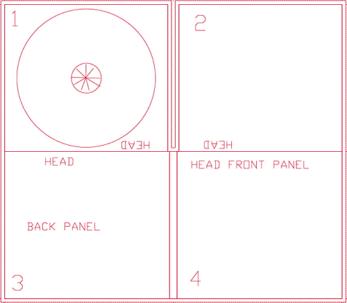
DIGIPAK

This is our most recent progress on the digipak design. We have used the initial design for the cover which I hand sketched. For the inside left panel we used an image we went with a street art design. We used this image because we thought it fit well with the arty and organic theme. We used a vinyl for the actual disc, and placed the same image from the front cover.
Friday 10 February 2012
Director's commentary feedback
RUN
Good and considerate understanding of the technologies used in production of the video, for example in terms of the types of camera’s used and the quality available.
There are evident links between creative decision making and use of technology on both productions of the video using professional digital cameras and in the post production editing process – in discussion of match of action, lip syncing and graphic matching’. This is sustained and thorough and accurate in discussion of the branded themes of creativity, authenticity and ‘hippie’ theme of the video
The commentary shows a discrete awareness of the use of new media technology and uses discriminating examples really well for example in FCP: particularly to selection and construction of narrative, editing techniques, such as cross cutting and the pacing used. This knowledge and understanding is evident in the use of colour saturation and adjustments.
Commentary attempts to evaluate online technologies, the use of creativity which the digital technologies enabled.
Excellent command of terminology and well presented. There is sustained justified decision making links between the technologies used the product and audience reception in terms of the creativity that the group used..
Evaluation task director's commentary
RUN
Good and considerate understanding of the technologies used in production of the video, for example in terms of the types of camera’s used and the quality available.
There are evident links between creative decision making and use of technology on both productions of the video using professional digital cameras and in the post production editing process – in discussion of match of action, lip syncing and graphic matching’. This is sustained and thorough and accurate in discussion of the branded themes of creativity, authenticity and ‘hippie’ theme of the video
The commentary shows a discrete awareness of the use of new media technology and uses discriminating examples really well for example in FCP: particularly to selection and construction of narrative, editing techniques, such as cross cutting and the pacing used. This knowledge and understanding is evident in the use of colour saturation and adjustments.
Commentary attempts to evaluate online technologies, the use of creativity which the digital technologies enabled.
Excellent command of terminology and well presented. There is sustained justified decision making links between the technologies used the product and audience reception in terms of the creativity that the group used..
Tuesday 7 February 2012
Monday 6 February 2012
EDITING SUITE
It took us several weeks to place the shots on to the timeline and cut them to beat. We encountered some problems with the story line as we were missing some key shots. During editing we decided to make some adjustments to the narrative by eliminating the twist at the end and using the narrative field shots randomly rather than in a specific order.
 We also noticed that there was a lack of continuity in the video caused by the lighting. We used After Effects to make the video into a more sepia tone.
Overall the video turned out pretty well after the editing. As a group we are anxious to see it once its converted into HD.
Overall the video turned out pretty well after the editing. As a group we are anxious to see it once its converted into HD.
Monday 14 November 2011
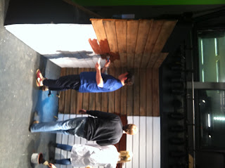
STUDIO SETUP
For the studio setting we bought some wood patterned vac-form, we painted it brown to create a barn setting. We placed the hay bales around the setup and scattered some around. We then placed the instruments in position ready for the shoot. Because the lead singer/guitarist was taller then everyone else and was covering the band, we stacked some haybales for him to sit on which actually worked pretty well as we were going for a chilled "band practice' feel.
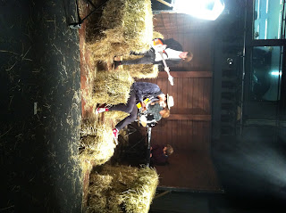
LIGHTING:
We set the lighting in a yellow-orange colour in order to give the effect of rays coming through the windows. For one of the blonde-heads we placed an opaque paper in front to make it appear natural.
Wednesday 9 November 2011
UPDATE ON OUR COURSEWORK
TASKS COMPLETE:
-We have found a farm where we can get haybales from. We have ordered 8 haybales to fill up the studio and turn it into a barn setting.
-We have sorted out the clothes for the actors.
-Cast has learnt the song and is prepared for the shoot.
TASKS INCOMPLETE:
- A trumpet and a person who plays it.
-Left handed guitar.
-Buckets.
-Bubble maker
As the narrative part of the video is longer, yet because of the sundown we have limited time for the shooting; we are planning on taking 2 cameras out.
We will start the preparation of the studio setting on friday in order for it to be ready for monday.
We will take the AS cast from PS on the day of shoot.
Barcode and Label


Friday 21 October 2011
Feedback
There is some sound understanding here and it is concise work. I feel you need to be more exacting with your understanding of CD digipak conventions and more reflective on CD cover designs. Perhaps you would like to revise this post.
Wednesday 19 October 2011
Letter to the Cast
Hi guys,
Here's a link to the song please learn the lyrics if you're singing (Jake), and your parts on the instrument if you are playing:
https://bac.hurtwood.net/owa/redir.aspx?C=50a569a37d964a7a8ae68b92ed2caecd&URL=http%3a%2f%2fwww.youtube.com%2fwatch%3fv%3dpKLlNLwVqWE
If you have your own instruments or if anyone has a bass guitar, electric guitar and a trumpet please reply to this email.
Costume Band:
Your own clothes, quite indie and hippi outfits please (not too colourful)
Field people, please be dressed very over-the-top hippi, colourful clothes, headbands, flowers in hair etc. on the 14th of November, don't forget !!
A2 students, please don't forget to give the bluecards back to us by this WEDNESDAY !!
(If anyone has issues with outfits etc. please ask)
Niall, Bodnar, Talisa
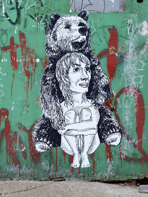
DIGIPAK THEME
As the main concern of our band is promoting their genre and their music rather then their personal image, we will not include a photograph of the band in the digipak. Because their quite a vibrant and entertaining band, an arty, partially comical cd cover will be well-suited in my opinion.
The main theme might consist of graphiti like quick sketches on cardboard and packaging.

The images will be hand drawn and will be similar to these:
The main theme might consist of graphiti like quick sketches on cardboard and packaging.

The images will be hand drawn and will be similar to these:
DIGIPAK
A digipak is a modern approach to CD packaging and is used for the inclusion of more information about the band/artist. The conventions are what the audience expects to see and is directly linked to the genre of music.
There are many decisions to be made when designing our digipak of which one is deciding wether we will use a 4, 6 or 8 side pak. We are leaning towards the 4 side digipak because we feel it will best reflect the simplistic image of the genre and band.
Here is an example of a 4 sided digipak template:
This is a good example of a 4 sided digipak by Jack Johnson. There are several specific things that work within this digipak which are worth considering. The vibrant colours attract the audience attention whilst the calm image on the cover gives a good example of the genre. The image reaches over the spine and on to the back panel. The title and the song list is written in the same font and is highly legible.
Looking at this digipak it is clear that the artist is not primarily promoting himself but rather his music as there isn't a clear photograph of him apart from the one inside the album which again is partially covered by a guitar.
Monday 17 October 2011
Copyright Letter to Record Label
To XL Recordings,
We are a group of A Level students working on an A Level project for a qualification in Media Studies. We are writing to request permission to use the following track as part of this project:
Vampire Weekend, Run.
We are a group of A Level students working on an A Level project for a qualification in Media Studies. We are writing to request permission to use the following track as part of this project:
Vampire Weekend, Run.
With your permission the track would be used as the accompaniment to a short form video that is made purely for assessment purposes and will have no commercial usage. The video will be viewed only by members of the school community and the assessor of the examination board.
The artist and the copyright holder will of course be fully recognized in the pre-production and evaluation material that accompanies the project. We can also include a full copyright notice if required both in the planning material and on the video itself.
Yours sincerely
Niall Green, Talisa Bergsen and William Bodnar-Horvath
Hurtwood House School
Friday 14 October 2011
Feedback
This is soundwork - there are evident clear accounts of your planning and research for your music video production day after half term
There are one or two ways to develop the blog. First to begin using a wider range of blogging tools - there are lots of well presented images, but use of Flickr or powerpoint will increase the creativity that is shown on your blog.
Second the reflective comments that you make need to be developed further with key media concepts and theoretical ideas; for example, link the planning to star image, or how set design and lighting link to mise en scene and/ or what model's of lighting you are using in relation to your set - key, fill, directional, discuss the intensity and colour and what you are trying to represent about your artist.
Try to add more detaile to your blogs
Begin to make the move beynd description - link ideas to real media, ie Star image/ Dyer
Location for the narrative
These are some of the possible paths and locations for the field shots:


Set/Lighting Designs
Our studio set is of a barn. We drew a sketch of our idea of a barn:


The mise en scene is the band performing in a barn. They will only be practicing there so they will be in quite chilled positions, sitting on the floor, on haystacks for example.
This is an example of a barn which gives us an outline of the wooden structure required:

Here are some of the props we will be using in the studio setting:


Feedback from Dan:
When we went to Dan with our idea, he told us that it would be hard to give the feel of an actual barn in the studio, however it wasn't impossible. For the wooden walls, we will be using some sort of plastic wallpaper which would not be too expensive and easy to use. We will be using natural lighting coming in in rays ( through gaps etc.). The level of light will depend on the weather on the day in order for it to fit in with the shots outdoor. We will personally provide the props such as haystacks, buckets, saddles, shovels etc.
Thursday 13 October 2011
Shooting Schedule
Our shoot date is the 14th of November. We are planning on shooting the studio part of the video in the morning from 8:50 am to 11:30 am, and the narrative storyline which is outdoors and on a field from 12:00 to 16:30 pm which is when it starts getting dark.
We might encounter some weather issues on the day of shoot, if it comes to this we will have to shoot the narrative part of the video on another date when the weather is better suited.
We will be needing more time on the shoot on the field as more shots will be required.
We also have to find time to drive to a nearby barn in order to have an establishing shot of the barn where the band will be performing.
Props List
PROPS LIST:
Instruments
Studio barn setting:
-Acoustic guitar (Will B.)
-acoustic bass guitar
-drum kit
-keyboard (Rollo S.)
Field:
-horns (trumpet)
Clothes
Band:
indie, clothes from their own wardrobe
Farmer in the end:
-denim dungarees
-lumberjack shirt
-muddy wellies
Cast: own wardrobes plus:
-pink skirt (Aimee Watts)
-hats
-bandanas
-flowers and feathers for hair
-waistcoats
-crop tops
-playsuits
Extras
Studio barn setting:
-hay
-chairs
-old school battery radio (Niall G.)
Field:
-bubble maker
-native American headpiece
-bicycle (old school, thin tires)
-dog
-Pull-cart
A Rough Cast List
Narrative (Field)
The list below is our cast list for our field scenes in the video, we need a fair amount of people for this part of the video to work as we need to create a crowd like atmosphere leading up the final scene outside the barn.
Ollie Baynham
Mina Hambro
Bella Speaight
Plum O’Keeffe
Jess Adam
Georgina Morton
Kyle Foreman
Sola
Charlie Lindsay
Will Barlow
Sarah Findlay
Lavinia Di Loernzo
Daniela Wild
Josie Fellows
Ellie Wilson
Simon Wood
Kate Boucher
Will Edgley
Lillie Resta
Sunshine
Jana Page
Aimee Watts
Lara Pitctet
Band (Studio)
Below is the list of band members we would like for our video.
Patch Wadsworth (Drums)
Jake Cecil (Lead singer, Guitar)
Rollo Spreckley (Keyboards)
Freddie Dixon (Bass Guitar)
Animatic Storyboard- Run by Vampire Weekend
To make this animatic storyboard, we first created a hand-sketched storyboard which we then filmed and edited using FinalCut Pro. During this process we noticed that we didn't have quite enough performance shots, which was a thing which we needed to work on. However because the production was now easier to visualise, we thought of good shots during our editing session.
Friday 30 September 2011
Feedback
Excellent concepts blogged. These are detailed and through and you have been creative with your blogs, I particularly like the use of art/technology. You have a secure knowledge and understanding of who you want your artist to be signed to; perhaps you could link this further by stressing the advantages that your artist has signed to the particular record label. Your clearly identify your target audience and have profiled them well. Excellent research into CD covers and you have a wide range of examples, and this would be developed further if you can link the real product to how it will influence your own designs.
Thursday 29 September 2011
DIGIPAK Cover Design Ideas
After all my research on digipak covers, I decided to go with an artistic album cover for Cape Karoo. I used cardboard from a delivery box as base and drew a graphiti-like sketch on it. I distressed the cardboard on purpose to add a worn-off quality to the design. I carefully chose the font of the band, not too obvious, in order for it to blend in with the theme. When I transfered the design on to the computer, I played with the colour and tone slightly on photoshop.
This is my final choice of cover:

These are some of the other versions that I considered using:


This is my final choice of cover:

These are some of the other versions that I considered using:


This is the original version of the cover:

Wednesday 28 September 2011
DIGIPAK COVERS
Looking at similar artists, I have found that most of the indie bands tend to have album covers of creative photos, logos etc. rather than a classical photo of the band being "cool". Although normally it is more common and beneficial for the band to promote themselves using a photograph of the band, especially with their first album, and be recognized as individuals and with their star image, in bands like CapeKaroo it is clear that they put their creativity under the spotlight and not their personal popularity. This is another example that demonstrates that they are no where near to being a mainstream band.
Here are some digipak covers I looked at:
-Manic Street Preachers, Journal For Plague Lovers
 This is quite an interesting cover choice because it is of the work of a famous artist, Jenny Saville. This tells us a lot about the target audience and the image because they are demonstrating how creative and alternative they are while addressing an art-following audience.
-Air, Moon Safari

Here the band Air have been witty with their cover choice. By having themselves in a cartoon version, they are both showing their indie and unusual look while promoting their faces as well.
-Beirut, The Flying Club Cup
 Although in this cover there isn't much obvious information on the band, it actually reflects loads about the music they create. This very arty yet simple sepia photograph gives the Beirut-feel to the audience, this is what you picture when listening to Beirut songs.
-Kings of Convenience, I'd Rather Dance With You

This is the album cover of a single ' I'd Rather Dance With You'. It is a shot from the actual music video of the song. This is an simple yet unusual approach. The music video itself is also quite arty and creative therefore I think it was a good idea to use a photograph from it. The two mediums also reinforce and support each other making the theme even stronger.
Here is the music video of I'd Rather Dance With You
-Fleet Foxes, Helplessness Blues

Fleet Foxes are exceptional when it comes to album cover designs. It addresses an artistic audience. It is so interesting that it can even attract a buyer who isn't familiar with the band just by standing on the shelf in a record store.
-Sigur Ros, með suð í eyrum við spilum endalaust
 This is also an unusual album cover. It shows that the band is humorous, interesting and edgy. This particular cover addresses a younger audience regarding its theme. It gives quite a young and "free-spirit" feel.
Here are some digipak covers I looked at:
-Manic Street Preachers, Journal For Plague Lovers
-Air, Moon Safari
Here the band Air have been witty with their cover choice. By having themselves in a cartoon version, they are both showing their indie and unusual look while promoting their faces as well.
-Beirut, The Flying Club Cup

-Kings of Convenience, I'd Rather Dance With You
This is the album cover of a single ' I'd Rather Dance With You'. It is a shot from the actual music video of the song. This is an simple yet unusual approach. The music video itself is also quite arty and creative therefore I think it was a good idea to use a photograph from it. The two mediums also reinforce and support each other making the theme even stronger.
Here is the music video of I'd Rather Dance With You
-Fleet Foxes, Helplessness Blues

Fleet Foxes are exceptional when it comes to album cover designs. It addresses an artistic audience. It is so interesting that it can even attract a buyer who isn't familiar with the band just by standing on the shelf in a record store.
-Sigur Ros, með suð í eyrum við spilum endalaust

Institutional Context of CapeKaroo

Domino is a British independent record label. However as it has progressed quite swiftly, therefore it has wings in other parts of the globe such as in the US. Germany, and France. They are hardly a minor record label as they have signed many big names such as Franz Ferdinand and The Arctic Monkeys and are doing quite well as far as the indie business goes.
How the band could benefit from being signed to Domino:
-their reputation in the indie music industry will allow them to reach the target audience
-potential world-wide distribution
-online distribution
-it is a well-established label, therefore is able to provide the band with the necessary funds.
-they will allow the band to maintain their original creative and alternative image
Target Audience
For our music video to the song 'Run', we have come up with a rough profile of the potential audience in order to make a video which can address them directly therefore succeeding in the industry.
(The target audience for the band Cape Karoo, is a fairly specific and niche audience)
- Both male and female audience between the ages of 17-35.
- Underground and experimental music followers.
- Blog followers.
- Indie fans.
- People who prefer the use of real instruments used creatively rather then fully electronic-produced.
- Fans who appreciate music for the talent rather than the star image.
- Festival goers (Glastonbury, Isle of White etc.)
- Alternative and creative profiles ( artists, musicians etc.)
Another good reason to target a specific audience is to follow a more effective marketing pattern. For example, with this profile in hand we can advertise the band in popular blogs, festivals, trendy and alternative magazines, underground gig ambiances etc.
Thursday 22 September 2011
Intertextual References
Alongside other music productions, we also came across some very useful intertextual reference examples during our research.
In the Levi's add Go Forth, there were some quite good shots of natural elements similar to the ones we are planning on using in our music video. We also quite liked the girl in the feathery jacket flowing in the wind.
In the Levi's add Go Forth, there were some quite good shots of natural elements similar to the ones we are planning on using in our music video. We also quite liked the girl in the feathery jacket flowing in the wind.
Because we are planning on including some form of vehicle ( most probably bicycles and a vintage car), this Lucozade add caught our attentions. We thought that the band on the bikes, and skateboards was quite a creative and witty idea. We also very much liked the tricycle with the instruments and speakers on it. We are considering using the tricycle speaker idea in our production (if we can get hold of one that is :) )
Friday 16 September 2011
Feedback
You had produced some concise work with your blog entries. In order to develop the detail to your work you need to revise your class notes and add some detail to the comments you make, for example, look at the work on Dyer and Stars, Negus and the video as a promotional tool. You have been creative with and to an extent visually dynamic with your blogging – there is a clear sense of brand identity.
You have produced proficient work with your blog. There is a good understanding of what the task demby providing more annotated points.
Treatment
The song we are thinking of doing is Run by Vampire Weekend. The reason why we chose this song is because it has a lot of different instruments which sits perfectly with our music video theme of the marching band.

We are planing of using random retro shots such as children at play etc. We want to do these shots with an over exposed sephia effect to give it a ''home-video'' feel.

We will use the idea of a marching band in the field, like in the music video I Love Your Smile.

We also want to include shots of the environment like the field, bicycles, closeups on flowers etc.

We are thinking of using various cameras for our shoot, because the desired effect isn't a perfect, clean shot, but rather a retro, indie feel.
Subscribe to:
Posts (Atom)